For centuries, painters and anatomists argued about whether all four of a horse's hooves leave the ground during a full gallop. Nobody could settle it by watching. The motion was too fast, the eye too slow, and every artist who'd ever painted a galloping horse was essentially guessing.
Then a photographer named Eadweard Muybridge set up a row of cameras along a racetrack, each one triggered by a thin wire stretched across the dirt, and captured the gallop frame by frame. The hooves did leave the ground. But Muybridge's photographs also revealed that the shape a horse's legs make at full extension looks nothing like what artists had been painting for hundreds of years. Every galloping horse in every painting and sculpture was anatomically wrong, and had been for as long as people had been depicting them. Nobody noticed because nobody had ever slowed the motion down enough to see what was actually happening.

reconstructed as animation. The motion he froze, set back in motion.
I've been thinking about Muybridge lately, because I think something similar happens with edited content. When you watch a well-made podcast clip, you experience the whole thing as a single impression. It washes over you. You either stop scrolling or you don't. But the impression is made of decisions that are invisible at the speed the content is meant to be consumed: which frame the editor chose to cut on, which sound was layered underneath the voice at exactly the right moment, which two-second shot was included because it matched the narration in a way that ten other candidates didn't. Those decisions are the reason the piece worked, but you'd have to slow the whole thing down, the way Muybridge slowed down the horse, before you could see what's actually there.
So I've started doing that. Taking short pieces of edited content and going through them frame by frame, trying to see the decisions inside them. This is the first breakdown in what I hope will become a series.
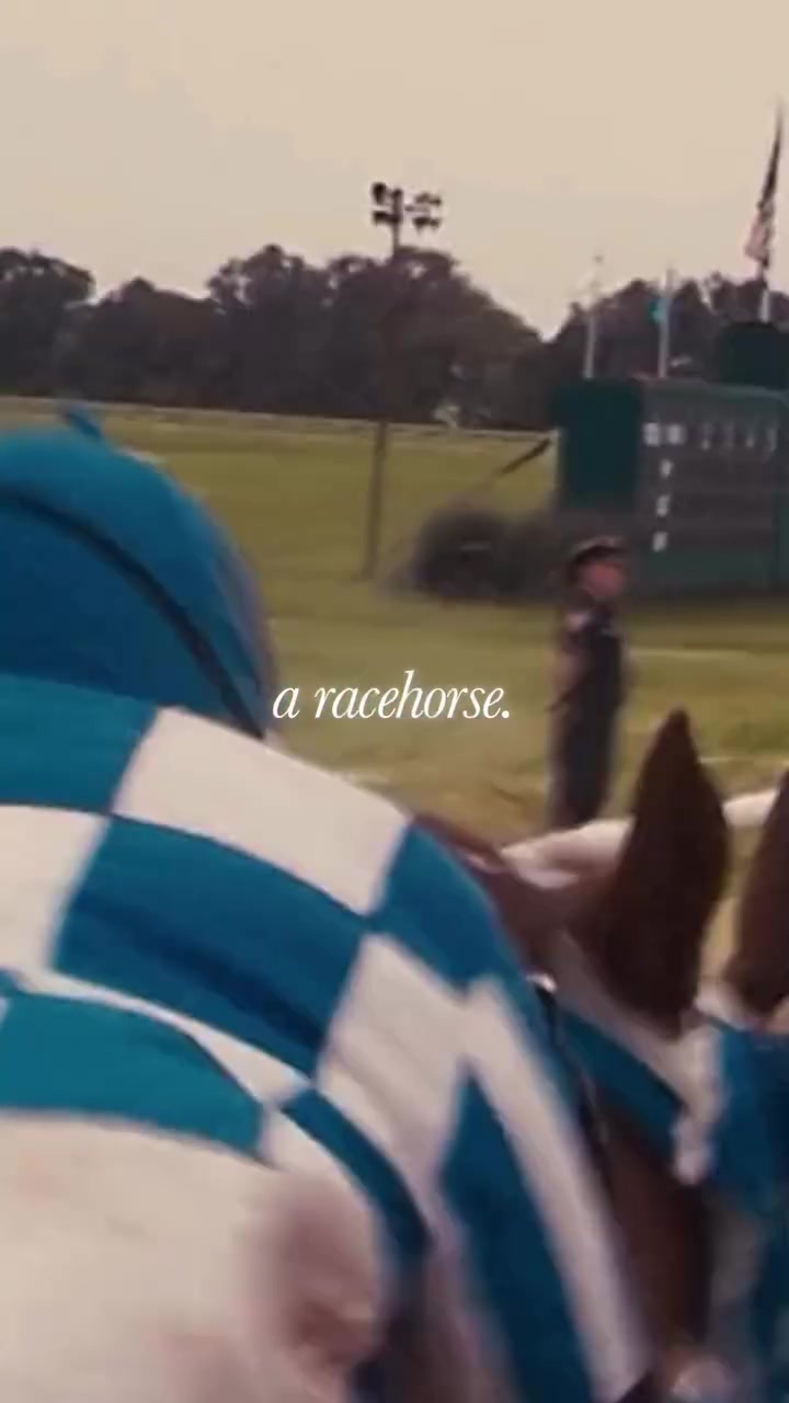
It's 20 seconds long, from the Founders podcast, episode #391 on Jimmy Lovine. David Senra, the host, has read over 390 biographies of entrepreneurs for the show. He's said he's rewatched The Defiant Ones, the HBO documentary about Jimmy and Dr. Dre, more than ten times, with certain scenes viewed over a hundred. This is a distillation of material David has been sitting with for years, and whoever edited the excerpt understood that.
Here's the transcript:
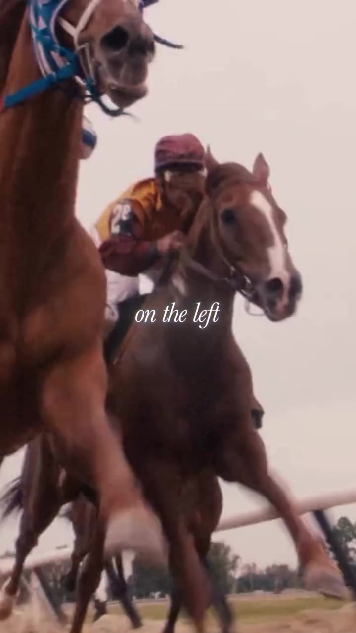
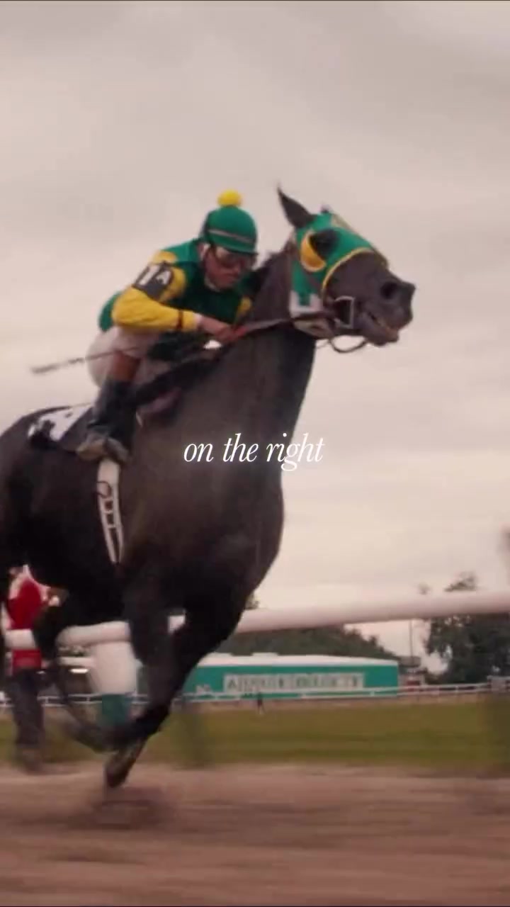
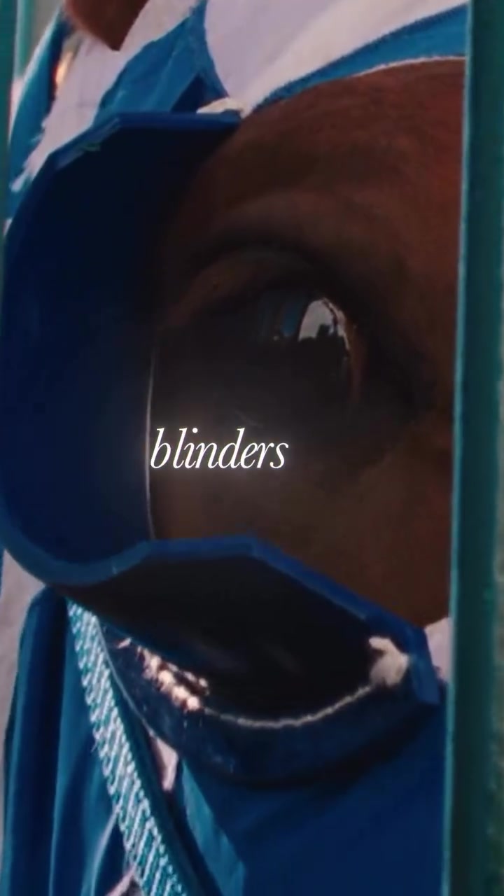
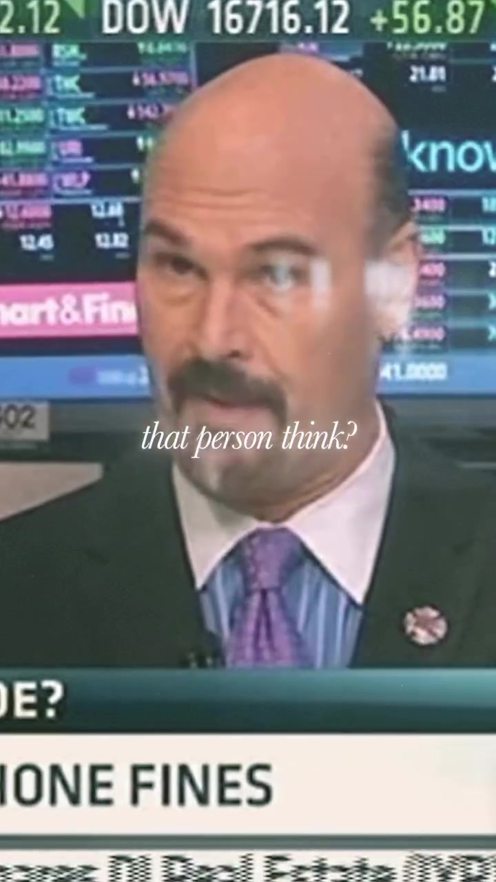
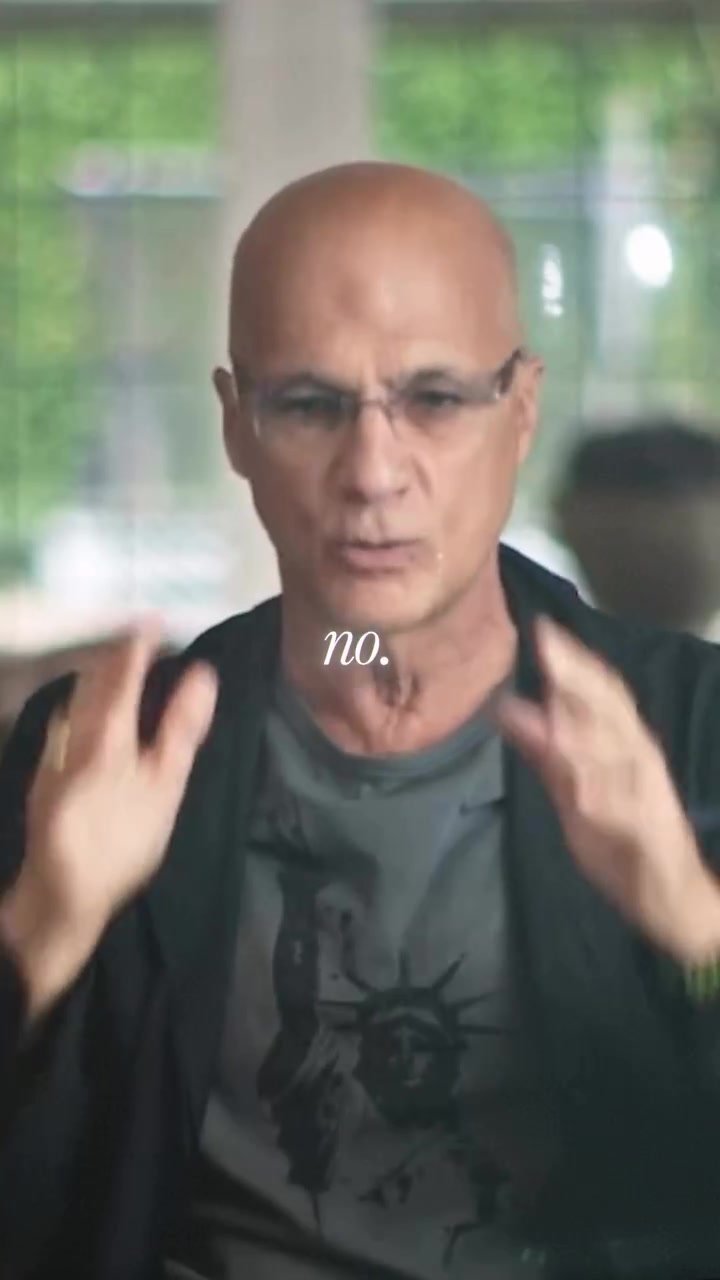
“I don't give a f*ck what anyone thinks. When you're a racehorse, the reason they put blinders on these things is because if you look at the horse on the left or the horse on the right, you're going to miss a step. That's why those horses have f*cking blinders on. And that's what people should have. When you're running after something, you should not look left and right. What does this person think? What does that person think? No. Go.”
Twenty seconds, built around a single metaphor that carries a complete thought from opening to close. What follows is an attempt to see what the editor did with it.
The Hook
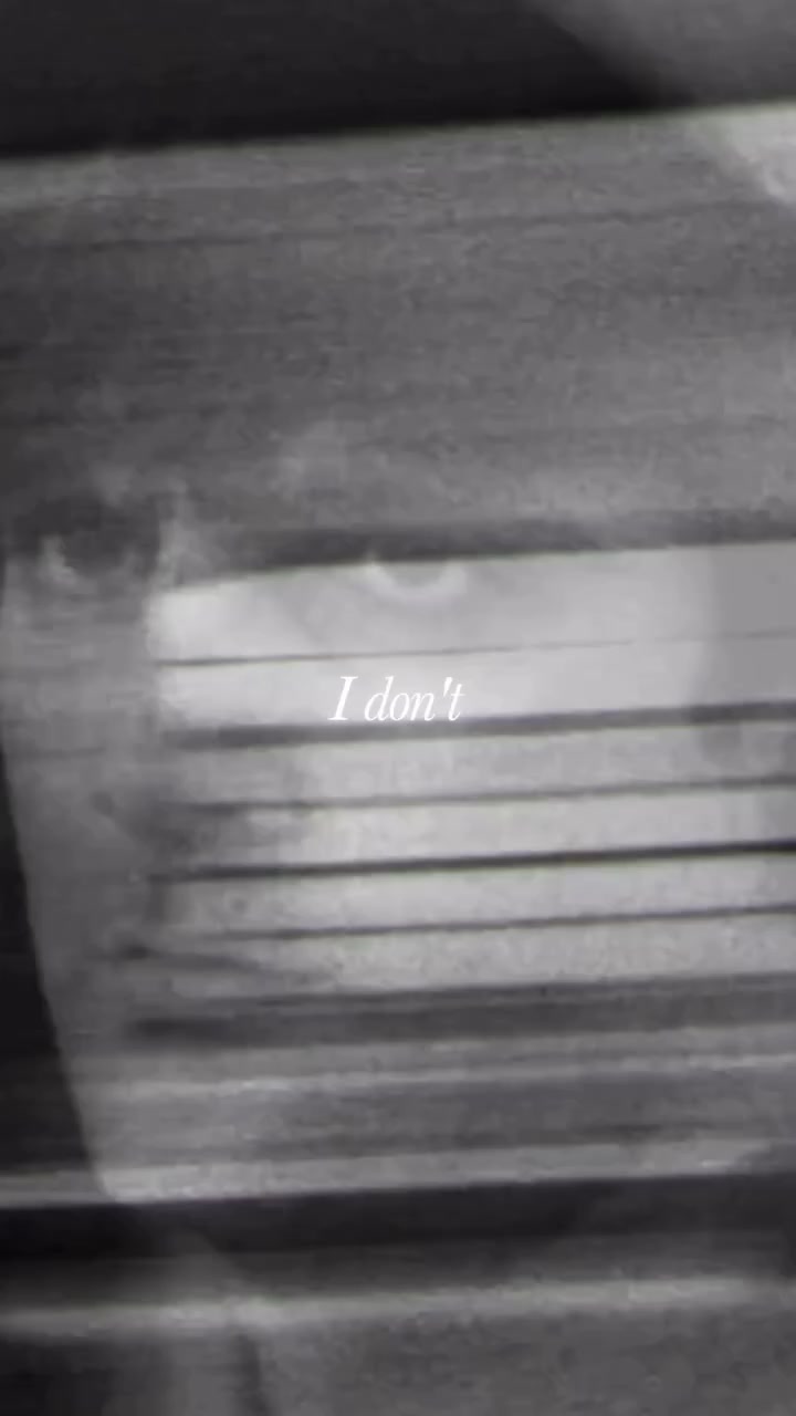

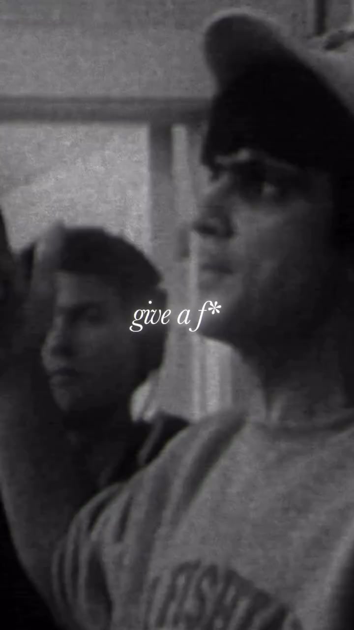
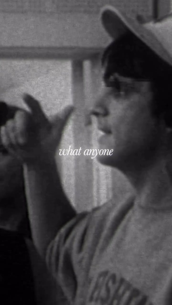
“I don't give a f*ck what anyone thinks.”
The excerpt doesn't introduce itself. There's no title card, no establishing context, no moment of orientation. It opens on a line with immediate velocity, and the viewer is responding to it before they've registered who's speaking or what the subject is.
The first editorial decision is already at work here, and it's easy to miss because it seems like there's nothing to decide. Look at who's on screen. His expression, his posture, how he's holding himself. We're hearing a voiceover, we're not watching him speak those exact words, but there's a coherence between the confidence in the audio and the confidence in the visual that makes the whole thing register as credible.
I've gotten this wrong in my own edits. Paired confident narration with footage of someone who looked uncertain, and the result had a quality of wrongness that was impossible to diagnose by looking at either channel in isolation. The audio was fine on its own, and so was the footage, but together they were producing a friction that undermined the content. Here, the channels agree, and because they do, the viewer absorbs the opening statement naturally rather than evaluating it.
Building the World
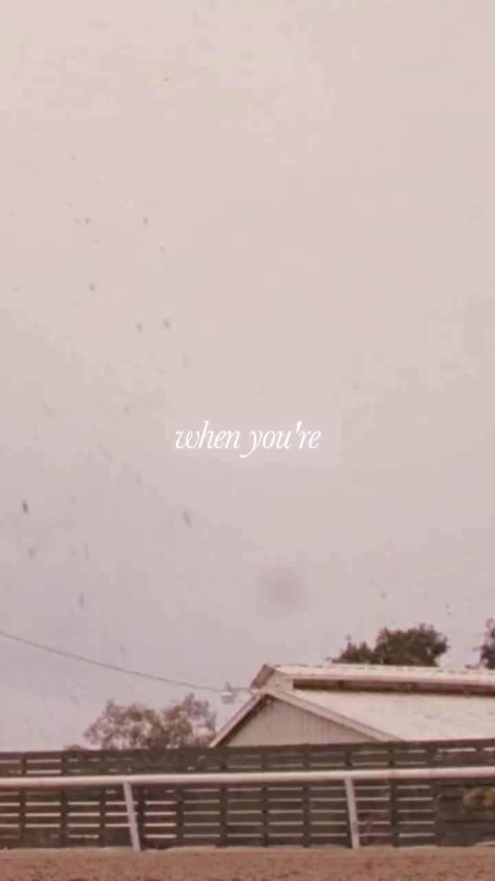
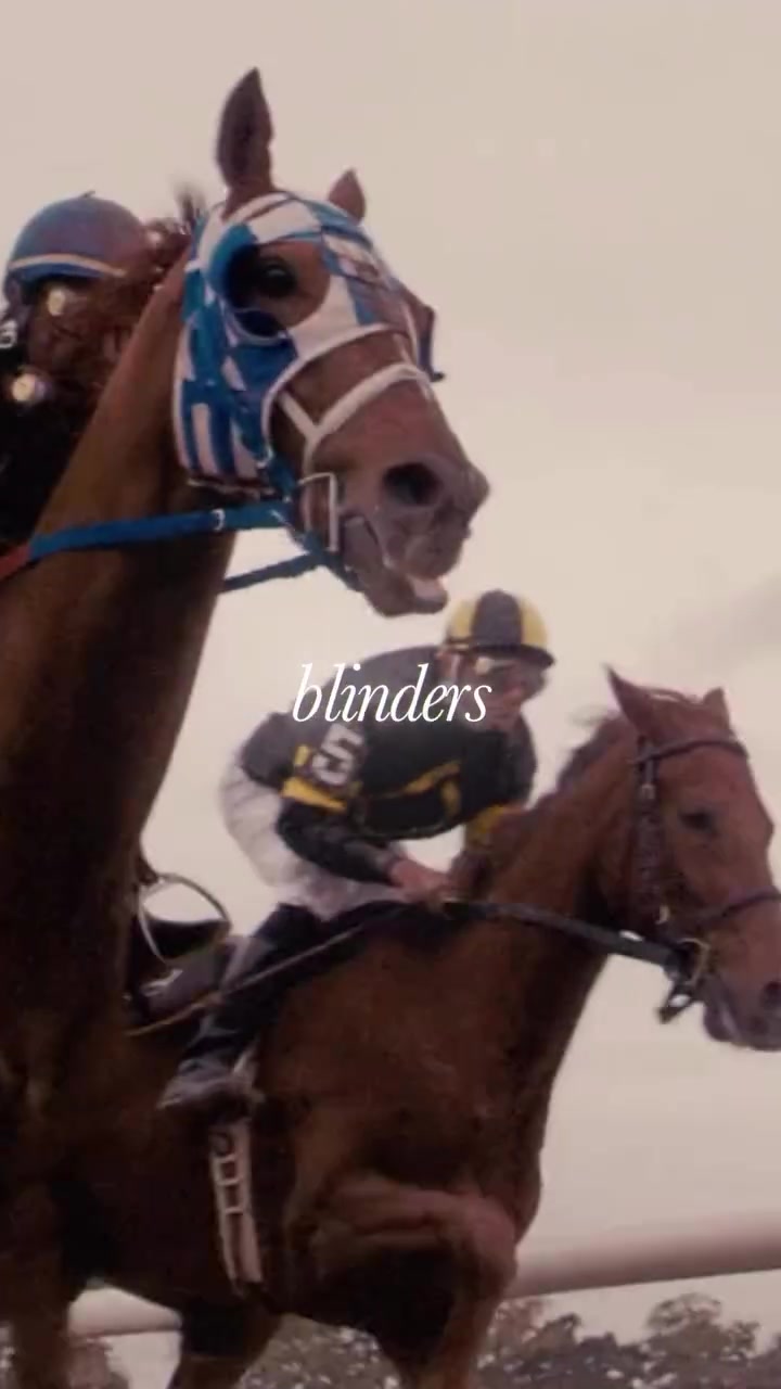
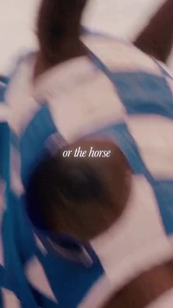
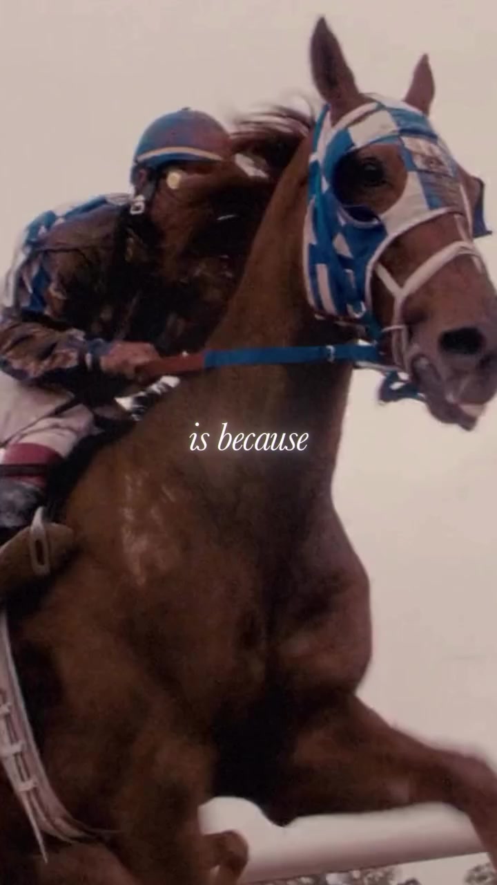
The narration moves into the racehorse metaphor, and the visuals follow directly: actual horses, an actual race, actual blinders on actual animals doing the thing that's being described.
This seems like an obvious editorial choice. Show what the speaker is talking about. But if you watch enough podcast clips, and I've watched hundreds at this point, you'll notice how often editors reach for footage that loosely approximates the narration instead of specifically matching it. A clip about focus might show someone typing at a laptop. A clip about competition might show a generic cityscape. The footage isn't wrong, but it asks the viewer to do a small act of cognitive translation, to bridge the gap between what they're hearing and what they're seeing.
The reason that translation matters, however minor it seems, comes down to how the brain handles audio and visual together. It doesn't process them as separate inputs and then check them for consistency. It fuses them into a single experience, automatically, before you've had a chance to evaluate anything. When the two channels agree precisely, they stop being two stimuli and become one experience. When they only loosely agree, the fusion still happens, but it's weaker. The viewer absorbs the content instead of inhabiting it. Generic alignment produces a loose association. Specific alignment produces something closer to a chemical reaction, where the audio and visual merge so completely that the viewer stops being aware of them as separate channels.
That's what's happening in this section. Someone went and found footage that specifically matches the narration. Not horses in general, but horses with visible blinders. Not a race in general, but hooves on dirt timed to the word “step.” Before AI tools made stock archives more searchable, finding this kind of specific match meant hours of manual work: scrubbing through footage libraries, previewing clips, looking for three seconds of a horse framed the right way at the right pace. It's unglamorous, patient work, the kind that most editors skip when they're trying to meet a posting schedule, and the kind that separates the clips that feel put together from the ones that feel considered.
The sound layer
Listen carefully around 0:06. Underneath the voiceover, there's the sound of hooves on packed earth, the ambient texture of a racetrack. David Senra wasn't at a racetrack when he recorded this. That sound was added during the edit.
Most podcast clips run the voiceover against either silence or a music bed. The difference between a music bed and sound design is worth understanding, because they do fundamentally different things. A music bed creates an emotional atmosphere. It tells you how to feel. Sound design creates a physical environment. It tells you where you are.
A shot of a horse running, viewed in silence, is something you observe from the outside. Add the rhythmic thud of hooves on packed earth, the sound of laboured breathing, the ambient wash of wind across an open track, and the shot is no longer observed. It's inhabited. The sound supplies weight, spatial depth, and physical texture that transform the viewer's relationship to the image from watching to being present. The visual tells you what's happening, and the sound tells you what it feels like to be there.
That's what the hooves are doing here. They're layering the voiceover into the world of the metaphor, and the viewer, who a moment ago was watching a clip on their phone, is now, in some small but perceptually real way, at the racetrack. That shift from watching to inhabiting is where the editor needs the viewer to be before the piece pivots.
The Pace — Ten Cuts in Nine Seconds


There's something I missed entirely until I went through this frame by frame. In the first nine seconds of the excerpt, there are ten distinct cuts. Ten different shots.
The conventional wisdom in editing holds that this is too many. The average shot length in most contemporary content sits around four to six seconds, and going significantly shorter risks overwhelming the viewer with visual information faster than they can process it.
But here, ten cuts in nine seconds feels not like chaos but like gathering momentum. And the reason, I think, comes down to something fundamental about how editing works. When two shots are placed next to each other, the viewer doesn't just see two images. Their brain fills in a connection that neither shot contains on its own. Show a face, then a bowl of soup, and the audience reads hunger. Show the same face, then a coffin, and they read grief. The face didn't change. The meaning came from the cut. Every edit is generating a third thing, an idea that only exists because of the juxtaposition. And when you stack ten of those in nine seconds, each one building on the last, the effect isn't speed. It's accumulation. Each cut adds another layer the viewer is constructing in their head, and the momentum you feel isn't coming from the images moving fast. It's coming from the meaning compounding.
In this excerpt, each cut introduces a new piece of the developing argument. Racehorses exist. They wear blinders. The blinders serve a purpose. Looking sideways has consequences. Every new idea creates a natural moment for a new visual, and because the sound is building and the narration is progressing, the viewer's brain treats each cut as a continuation rather than an interruption. The cuts are synchronised with the information density of the speech, and that synchronisation is what makes rapid pacing feel like forward motion instead of agitation.
There's a useful distinction here between what I'd call rhythmic cutting and anxious cutting. Rhythmic cutting is driven by the content: each new shot arrives because a new idea arrived, and the visual change serves the argument. Anxious cutting is driven by the editor's fear: the shots change because the editor is worried the viewer is about to get bored, and the cuts are serving the editor's nerves rather than the material. They look similar on a timeline but feel entirely different to watch. One carries you forward. The other jostles you.
If the audio here had been slower, someone sharing a quiet personal reflection, ten cuts in nine seconds would feel like the editor didn't trust the material to hold attention on its own. Here, the pace of the visuals matches the pace of everything else. The engine is running fast, and the driver knows exactly where they're going.
The Pivot
This is the moment the excerpt earns everything that follows.
For nine seconds, we've been in the world of horse racing. It's well-constructed and engaging, but around the eight-second mark, there's a shift in the quality of the viewer's attention. They've absorbed the metaphor. They understand blinders. And now a question is forming that they didn't consciously choose to ask: where is this actually going? Why am I learning about racehorse equipment?
This is how curiosity works. Not as a response to encountering something new, but as a response to becoming aware of a gap between what you know and what you want to know. You can't be curious about a question you don't know exists. The first nine seconds of this excerpt do something precise: they give the viewer enough information to see the shape of an argument but not enough to see its destination. The gap is perceivable but not yet closed. And because the resolution is only seconds away, the curiosity generates forward pull rather than impatience.
If the editor had held on to the horse imagery past this point, showing more racing footage, more blinders, more hooves, the viewer would lose interest at the exact moment they were most receptive to the message. The metaphor would overstay.
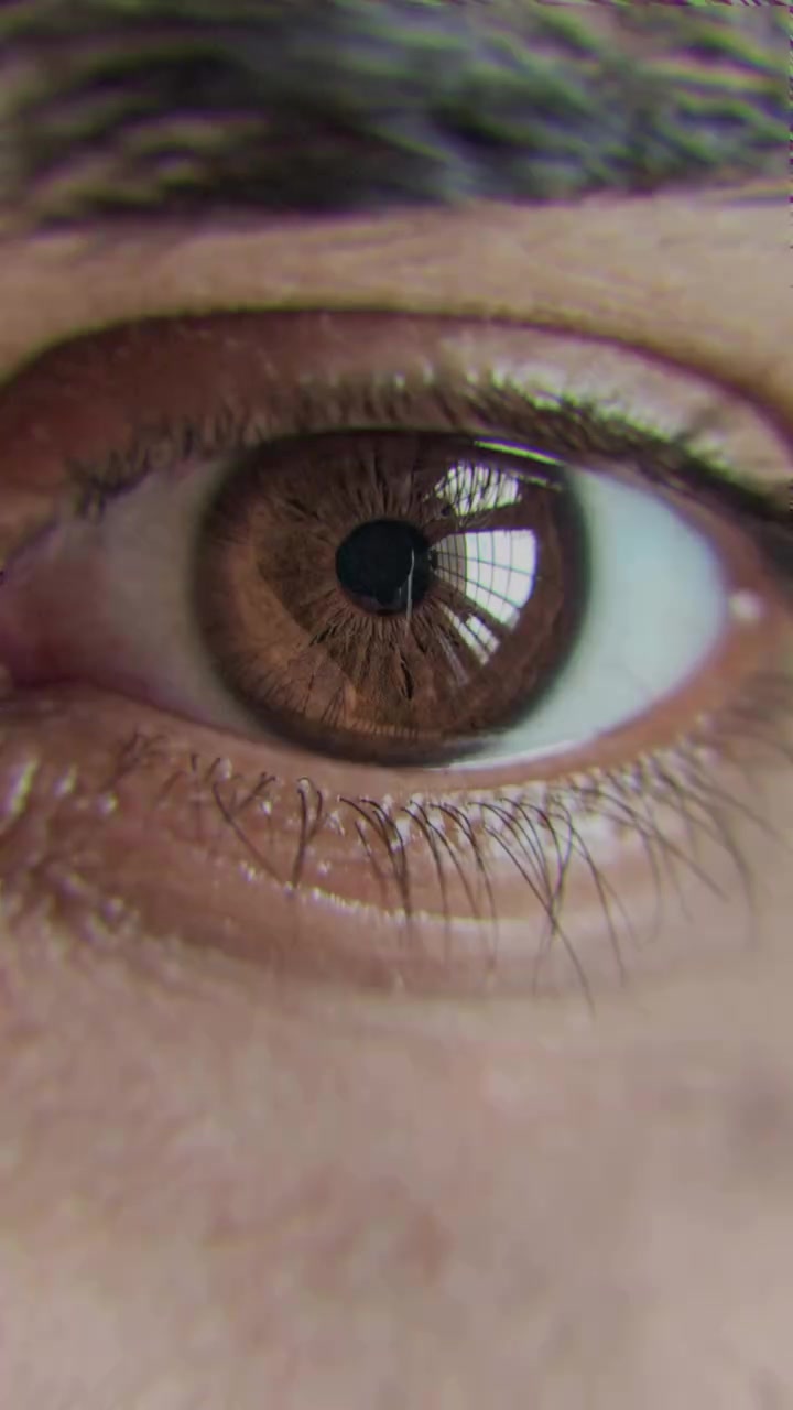
So watch what happens. Around 0:10, the camera begins a slow push-in on the horse's eye. The movement is gradual enough that it might not register consciously, but it narrows the visual field and creates a sensation of convergence, of the frame itself focusing.
Then it cuts. From the horse's eye to a human eye.
“That's what people should have.”
The two shots are framed almost identically: same shape, same position in the frame, same sense of an eye looking outward through a narrow aperture. The viewer's brain links them automatically, not as two separate images but as a single thought expressed across two shots.
This technique, bridging two shots through a shared visual element, has been a foundational part of film grammar since the early days of cinema. The most famous example might be Kubrick's bone-to-satellite cut in 2001: A Space Odyssey, where visual continuity carries the viewer across a leap of four million years. The principle is the same regardless of scale: when two shots share a visual element, the brain processes the transition as a continuation rather than a disruption, and the conceptual distance between them collapses. Here, the leap is from metaphor to personal application. The horse was never the point. The point is the viewer, and whether they're wearing their own blinders or spending their energy looking sideways.
The sequence of the argument is doing as much work as the visual cut. If the speaker had simply opened with “you need to have tunnel vision in life,” it would register as advice, one person telling another how to think. Because he walked the viewer through a genuinely interesting observation about racehorses first, building a metaphor with its own internal logic and momentum, he earned the right to bring it home personally. The viewer was engaged with something outside themselves, and when the argument pivots inward, it arrives not as instruction but as a realisation the viewer they're reaching alongside the speaker. The story earns the message, the metaphor earns the personal application, and the match cut makes the transition feel like a single continuous thought rather than a shift in subject.
Was this match cut deliberately premeditated? It might have been. No way it couldn't have been. But I want to be honest about something I've learned from my own editing. I've made cuts like this. Sometimes you're deep in a timeline, hours into an edit, and your brain starts finding visual connections between shots that your conscious mind didn't plan. You try a juxtaposition almost experimentally, it works, and when you watch it back it looks like you always intended it.
Making It Specific
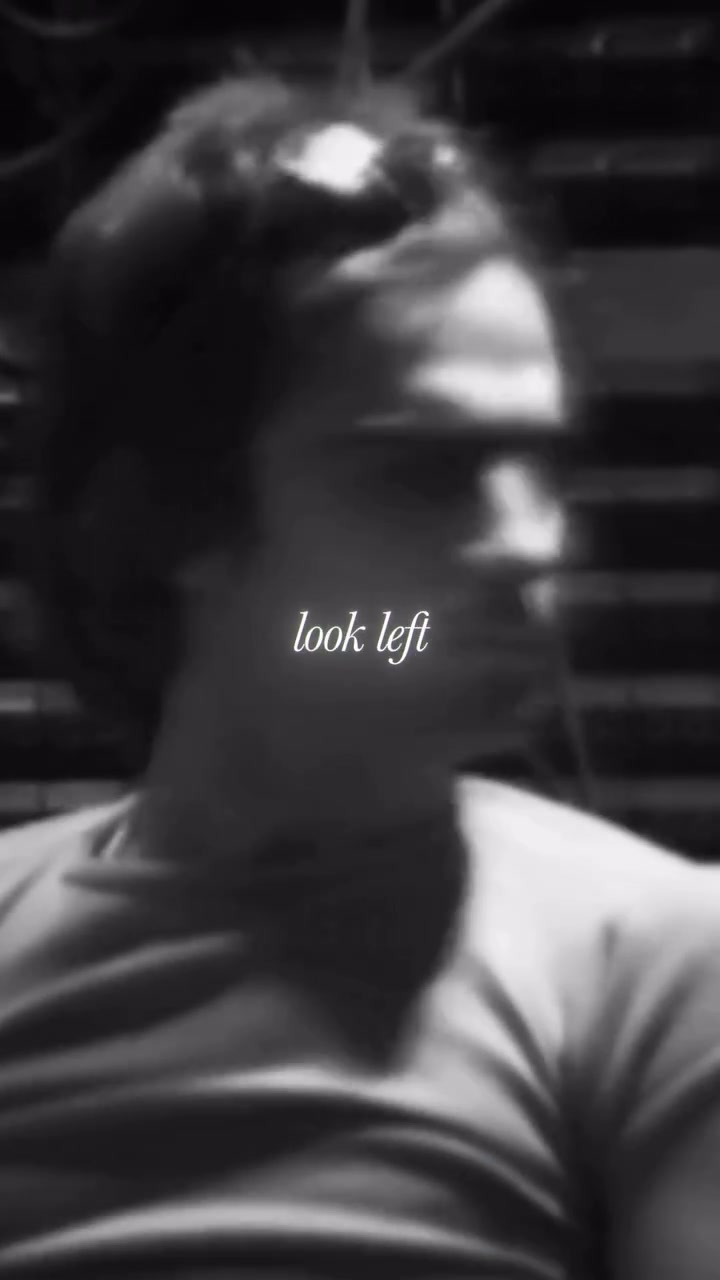
At 0:15: “You should not look left and right.” And the editor shows the subject literally looking left. Then right.
The directness of this choice is almost blunt, the visual restating the audio in the most literal possible way. But the bluntness works here because both channels arrive at exactly the same note at exactly the same instant, and the precision of that synchrony is itself the effect. You hear it and watch it in the same breath, and the coincidence of the two creates a moment of emphasis that either channel alone wouldn't achieve.
Consider what it took to find that footage. A clip of someone who happens to look left and then right, at a pace that matches the cadence of the narration. That's either a fortunate coincidence or someone scrubbing through substantial amounts of footage looking for exactly this two-second window. Probably some measure of both, which is the honest reality of editing at this level of specificity: the slow, patient searching for the right moment, followed by the good fortune of finding it, followed by the skill to recognise that you've found it. The craft lives in all three.
Payoff and Close
Near the end, there's a brief shot of people wearing Beats headphones. For a viewer who doesn't know Jimmy Lovine's story, this might feel like a non-sequitur. For anyone who recognises the brand and knows who built it, it's a quiet payoff: here's what came from all those years of not looking sideways, here's the thing the blinders made possible. The choice either connects or it doesn't, depending entirely on what the viewer brings, and there's something worth noting about editing that includes details not everyone will catch. It trusts the audience enough to leave something for the attentive viewer without pausing to explain it to everyone else.
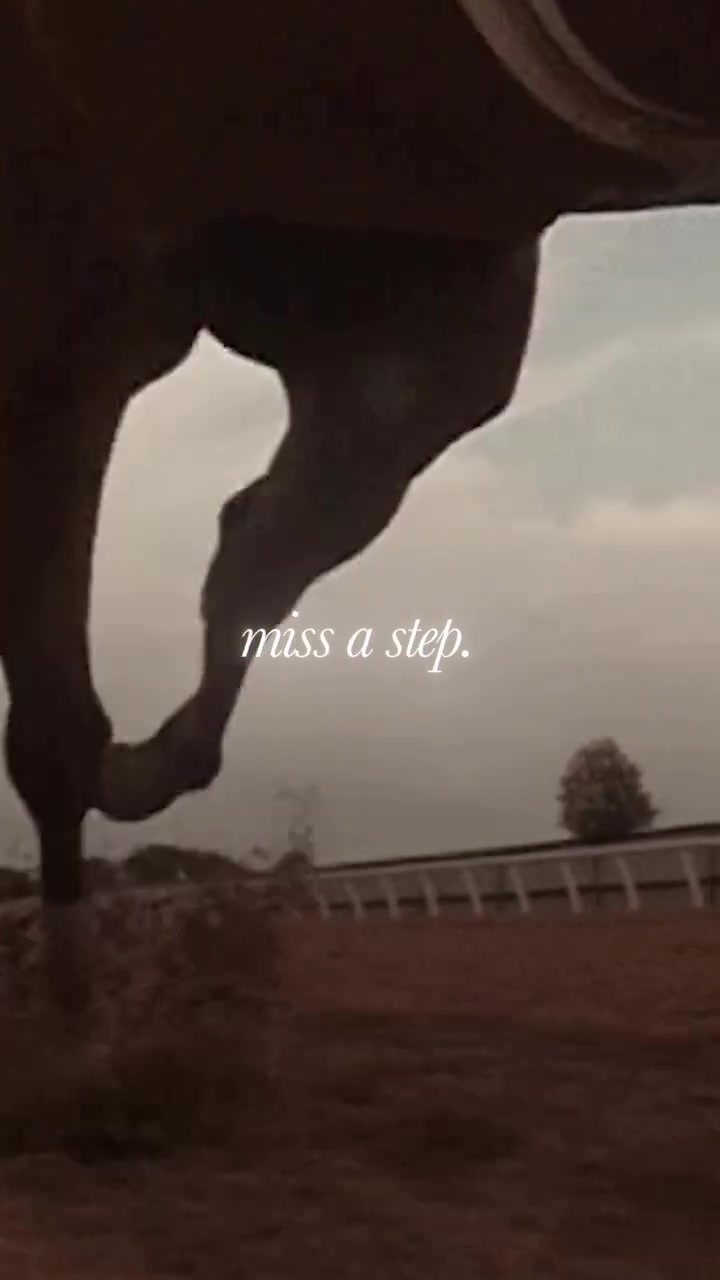
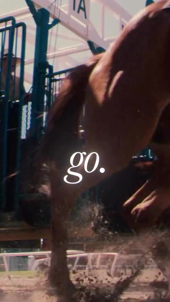
Then the final moment. As the audio reaches “No. Go!” the image is the back leg of a horse at full stride, kicking off the ground.
The editor hasn't forgotten where the excerpt started. The horse metaphor opened the piece, and now it's closing it. A single second, maybe less, but it completes a structural loop. The argument opened in a particular visual language, explored it, pivoted it toward personal relevance, and now returns to that same visual language for its close. It's the same move musicians make when they return to an opening theme at the end of a piece, transformed by everything that came between. The horse at 0:20 is the same image as the horse at 0:02, but it means more now. The viewer has travelled through the metaphor, experienced the pivot, absorbed the message, and the return carries all of that accumulated meaning with it. There's a sense of wholeness, of having been taken somewhere and brought back, that comes from this kind of structural closure.
And the image itself is saying the same thing the words are saying: don't hesitate, don't look around, don't wait.
Why This Matters Beyond This Clip
This excerpt works because the editing is precise and considered. But it also works because the editor was given material that contained the possibility of a good edit within it.
If I had to name the single most important factor in whether a podcast excerpt succeeds or fails, I wouldn't point to the editing. I'd point to the source material. Jimmy Lovine reached for a metaphor that's inherently physical and visual, and that choice, made in the flow of a conversation, created everything the editor later built. When the raw material contains that kind of concrete imagery, the editor's role shifts from manufacturing interest to amplifying and shaping something that already has a natural pulse. The ceiling of what's possible in the edit rises dramatically.
The reverse is equally true. Some quotes are insightful but built from abstractions rather than images, and an editor working with abstract material faces genuine constraints. Talking heads, generic stock footage, a music bed carrying most of the emotional weight. The result can be competent and watchable, but the likelihood of producing something that stops a viewer mid-scroll drops considerably, because the editor is creating visual interest from scratch rather than amplifying interest that was already encoded in the speaker's language.
The best excerpts don't impose meaning on the material. They reveal the meaning that was already there.
The best excerpts don't impose meaning on the material. They reveal the meaning that was already there, shaped and sequenced so the viewer can see it clearly. The editor's job, in those moments, is less like authoring and more like translating: finding the visual and sonic language that lets the spoken idea arrive with its full weight.
If you're an editor, recognise when you've been handed material with built-in imagery and a natural arc. It's a gift that doesn't arrive every episode. Give it the time it deserves.
This is Part One. I'm going to keep breaking these down, one short excerpt at a time, frame by frame. If you found this useful, I'd like to hear which excerpts you think are worth looking at.