sref-1AK6N7
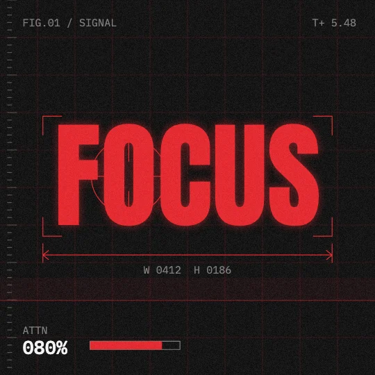
red technical annotations, grids and readouts around a bold word or shape on black.
Infographic & data · Medium
Preview is 9:16. Pick a shape to put it in the prompt; otherwise your AI asks you.
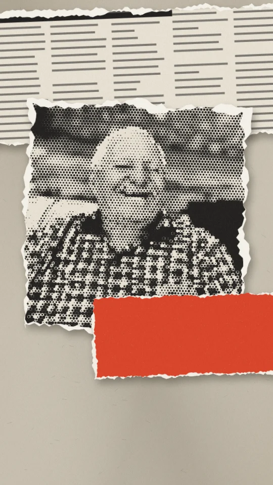
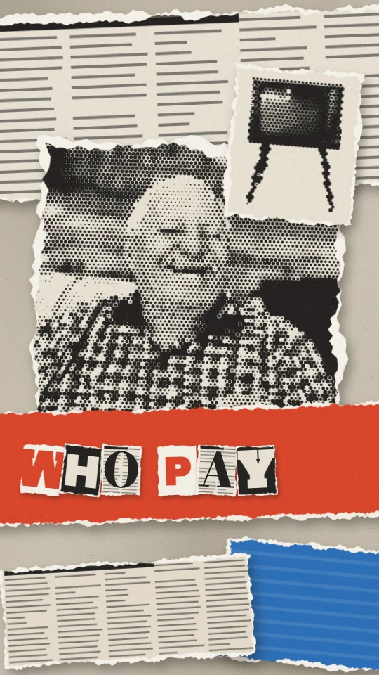
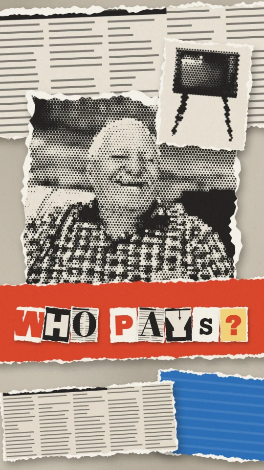
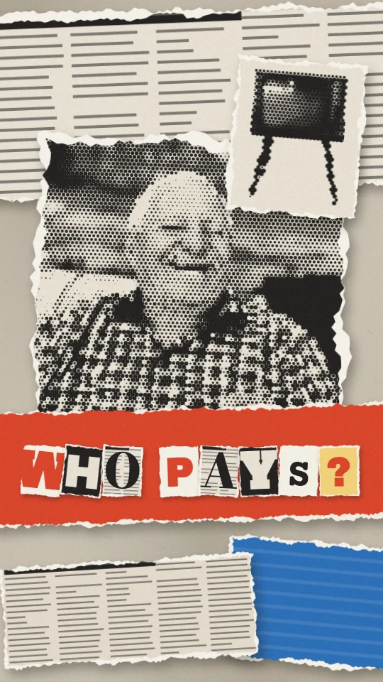
Layered strips of torn paper, newspaper and poster, headline letters cut from print.
Run most of the clip as full-frame layers of torn paper and cut headline letters that build as the argument builds, cutting back to the speaker once or twice.
Full scene: the scene fills the frame. Stock speaker from Pexels.
THIS IS A MOODBOARD, NOT A TEMPLATE. The style below is inspiration for the look and feel. Keep its materials, colours, textures and the way it moves, but invent your own scenes, characters and objects for this clip. You are not limited to anything shown in the preview, and nothing in it has to appear. Use illustration and animation to help tell the clip's story.

STORY FIRST. Read the whole clip before you design anything.
1. Write the clip's arc in one line: setup, tension, turn, pay-off. Name the one line that is the reveal.
2. Tag every sentence with its job: setup, context, tension, turn, reveal, example, number, contrast, list, quote, feeling, metaphor, callback, pay-off, aside.
3. The visuals carry the whole clip. If the clip shows the speaker's face, open on them (the first scene keeps them on screen) unless the person says otherwise. After that, never cut back to the speaker full-frame unless the person asks for it; if they do, only on the ending, never in the middle of an explanation. The speaker can still sit inside a scene (a corner, a split or drawn in) when the person wants to be seen.
4. Build one flowing visual story, not a new picture per sentence. Each scene covers a whole thought (one to three sentences), holds 3 to 8 seconds and turns into the next.
5. Start each scene on the first word of its sentence, or up to half a second before. Never cut mid-sentence.
6. Inside a scene, bring small details in on the words they show (an item, a tag, a tick). Earlier details stay.
7. Choose one or two recurring objects or characters in the first scene and bring them back changed. Callbacks beat new pictures.
8. Build up the same picture where you can (add to it, move the camera across it) instead of replacing it.
9. Energy: about 80 percent still, drifting or gentle. Allow one big move in the whole clip, on the reveal, for 1 to 2 seconds, then settle and hold.
10. Numbers sit on a scale (gauge, bar, table, timeline) and hold long enough to read. Contrasts are a still split or the same layout twice.
11. Feelings get a quiet image, or one of the cuts back to the speaker; never effects.
12. On-screen text names, labels or quotes; it never repeats the caption. Five words or fewer per label.
13. End every scene by settling or thinning out, or by turning into the next scene. No exit effects.
14. The style sets the look. These rules set when, how long and how calmly. If the style's own motion rules ask for more energy than this, use less.

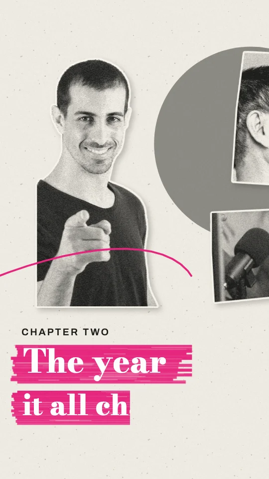
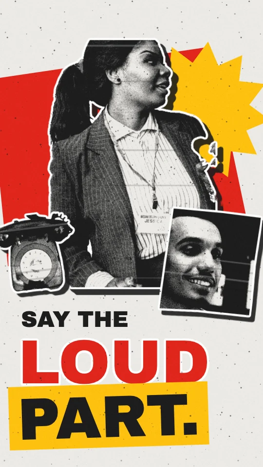
PICTURES: this style uses photo cut-outs. Before you start, ask the person one short question: use stills from their own clip, Slice's stock search, their own uploads, or (only if you can make images) images you generate. If they don't mind, use stills from the clip, then stock.

VISUAL STYLE: Torn newsprint
Slice style ref: sref-RYPEZC
LOOK: layered strips of torn paper: #E8E1D3 newsprint with fine columns of grey text lines, #BFB6A4 aged paper, flat #D9452B poster red and #2C6FB7 poster blue, all printed in #232220. Photo strips are printed too: coarse newsprint halftone, never glossy colour.
LINE AND FILL: no lines. Every strip has a fibrous torn edge with a pale paper-fibre band just inside it.
TEXTURE: newsprint halftone, fibrous torn edges, slight wrinkle shading on the ground.
LIGHT: soft drop shadows under each layer.
CAMERA: locked, or a slow vertical drift; layers parallax slightly against each other.
MOTION: 12 fps. Strips tear on and slide in from the edges, then hold. Ransom letters stamp in one at a time with a 1-frame jolt; the last one lands a little harder. Calm holds between.
TYPE: mismatched cut-out letters from print (slab, grotesque, serif and typewriter mixed in one word), each on its own small rotated paper scrap.
THE RULE: everything is a torn piece of printed paper on top of another.
DON'T: no clean geometric cuts, no glossy colour, no single matched typeface for ransom words.
Treat these as the look, never a template: invent fresh pictures, words and compositions from what this clip says.
Accent: as in the palette.
Frame shape: ask me before you start (9:16 vertical, 4:5 portrait, 1:1 square or 16:9 wide).
Energy: normal.

TECH: one HTML file, one GSAP 3 timeline created paused as window.__timelines.main, duration = the scene's length, transforms and opacity only.
For AIs: this style as plain text.
Need the clip first? Shorts by Slice cuts your long episode into captioned clips. Then give one this look.
Try Shorts by SliceShorts by Slice cuts your long episode into captioned clips. With Slice connected, your AI can then build scenes for a clip in Torn newsprint.
Shorts by Slice
From the team behind these free tools
One video. A week of posts.
Upload an episode and get back the moments worth posting, cut and captioned.